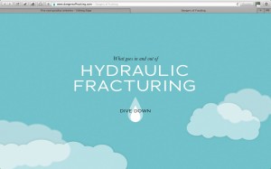
We’ve been looking at these one-page parallax sites as part of the copywriting brief for a new pharma website.
We love the way they use simple text and dazzling visuals – a powerful combination! Both text and graphics cascade down one very long Home Page like an animation, drawing readers into a story that unfolds as you read on.
http://www.dangersoffracking.com/
http://islreview.com/
http://www.tedxguc.com/
http://www.vondutch.com/
http://neomam.com/interactive/13reasons/
If you have other great examples, share them with us.


